Side Hustle Bootcamp portfolio: Analysing McDonald's menu nutrition fact

A week ago the side hustle training for cohort seven (7) was concluded, following this training series, we are now in the side hustle boot camp, which enables the interns to get hands-on training and experience.
To achieve this, a team of seven other interns and I have been assigned the task of working on McDonald's menu nutrition.
Table of contents
Source for the data
Loading and transformation
Creating hierarchies
Menu Page
Visualization
Step 1: source for the data
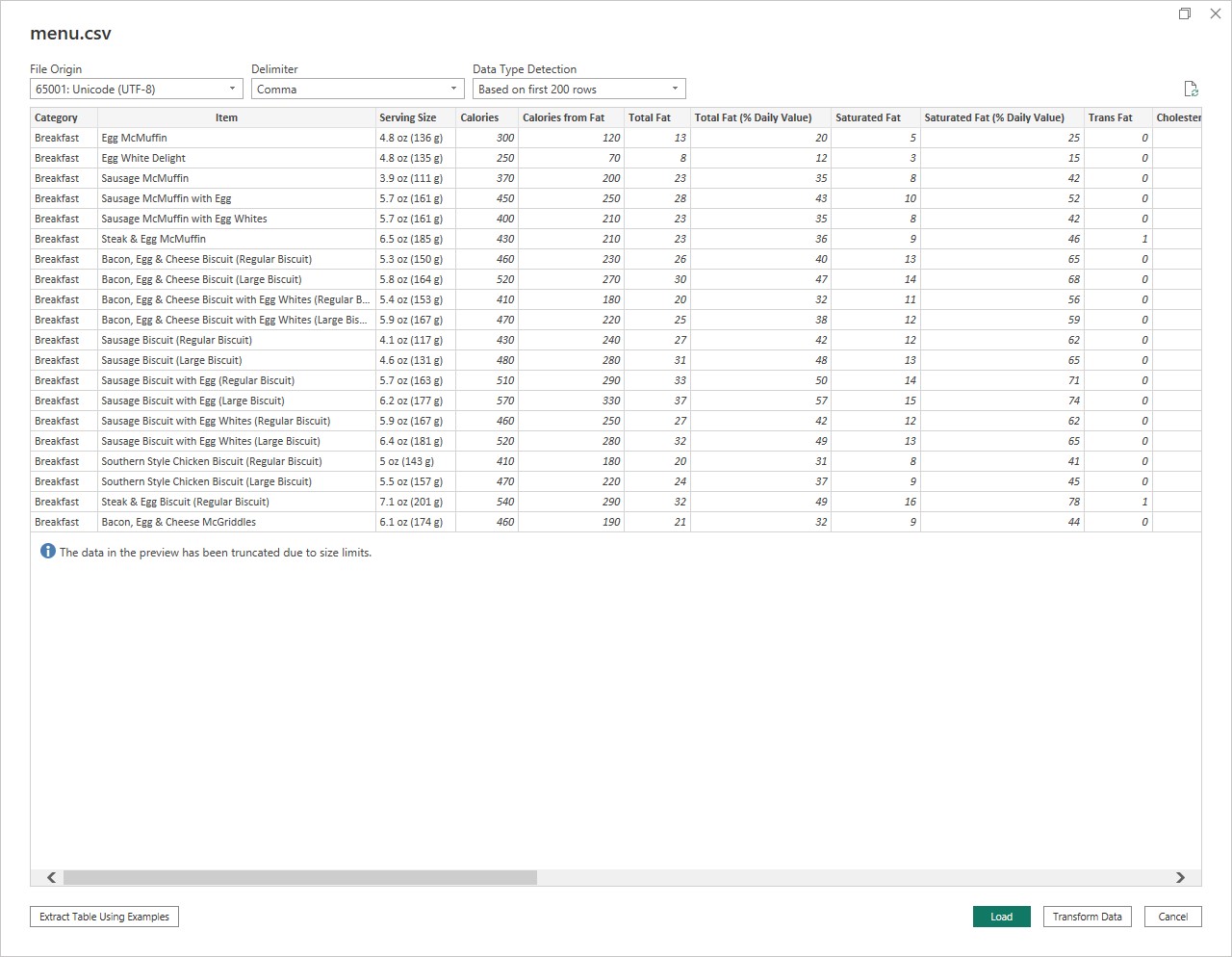
The dataset was sourced from Kaggle, the data contained 260 rows and 24 columns
Step 2: Loading the dataset
After the dataset was loaded, we proceeded to load the data in Power Bi

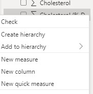
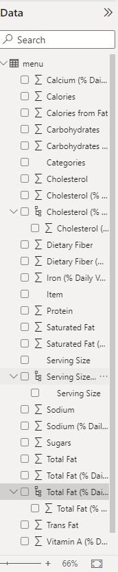
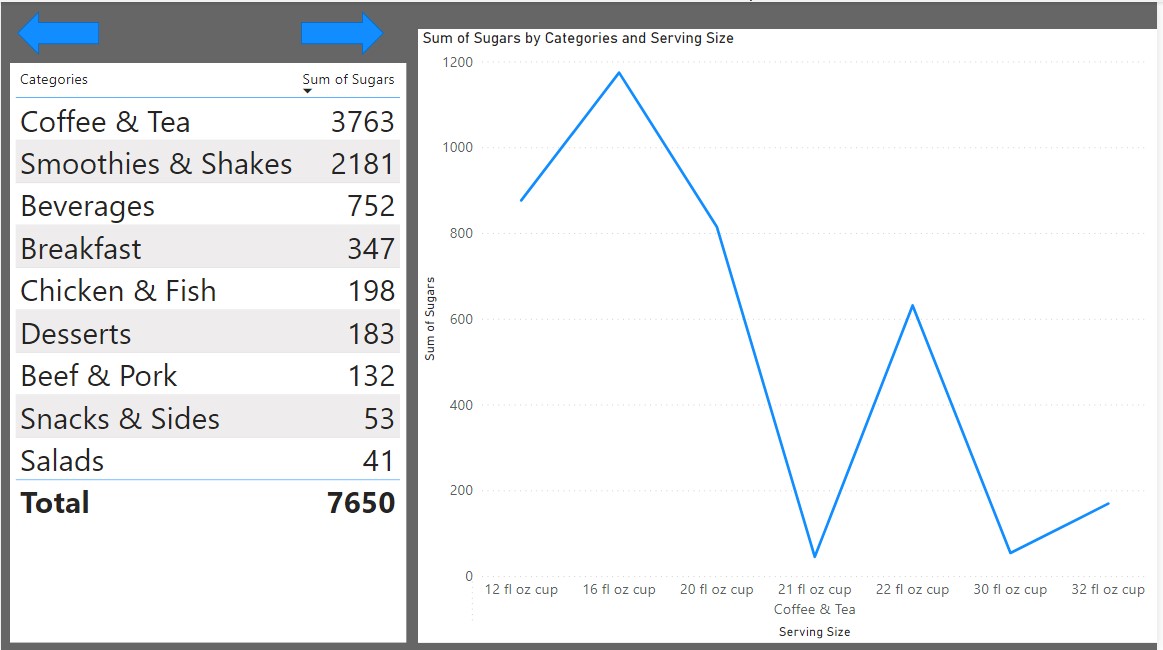
Step 3: Creating hierarchies
Hierarchies were created to enable drilling down in some visuals that were intended to be used
Step 4: Menu page
A menu page was created to enable easy navigation to each visual.
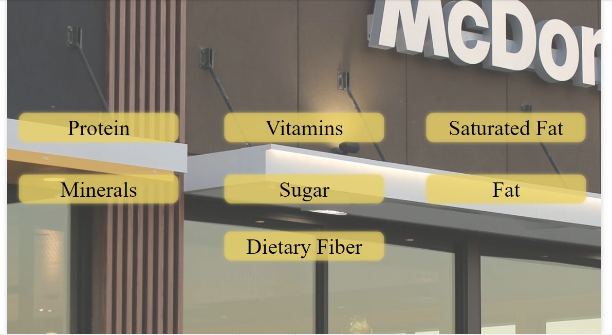
The navigation can be made by holding down the `ctrl´ key and selecting the page to navigate to.
Step 5: Visualization
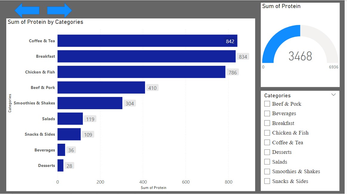
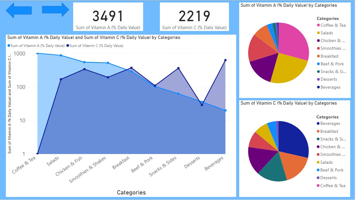
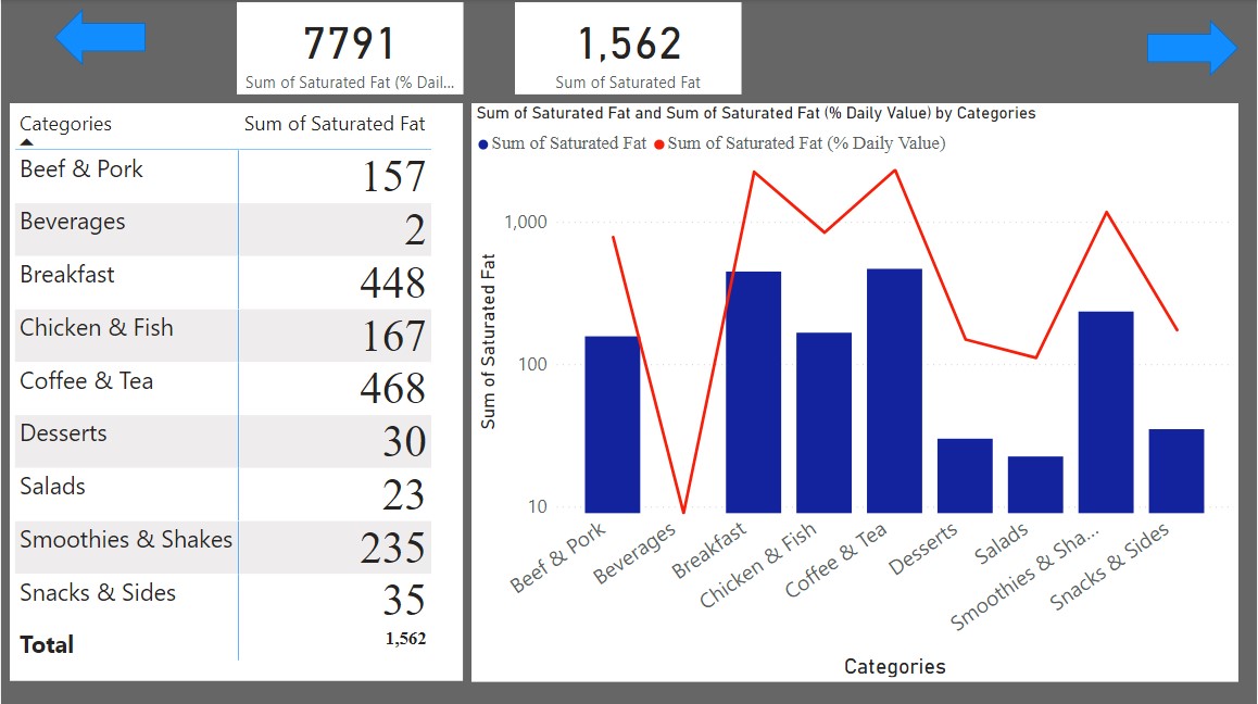
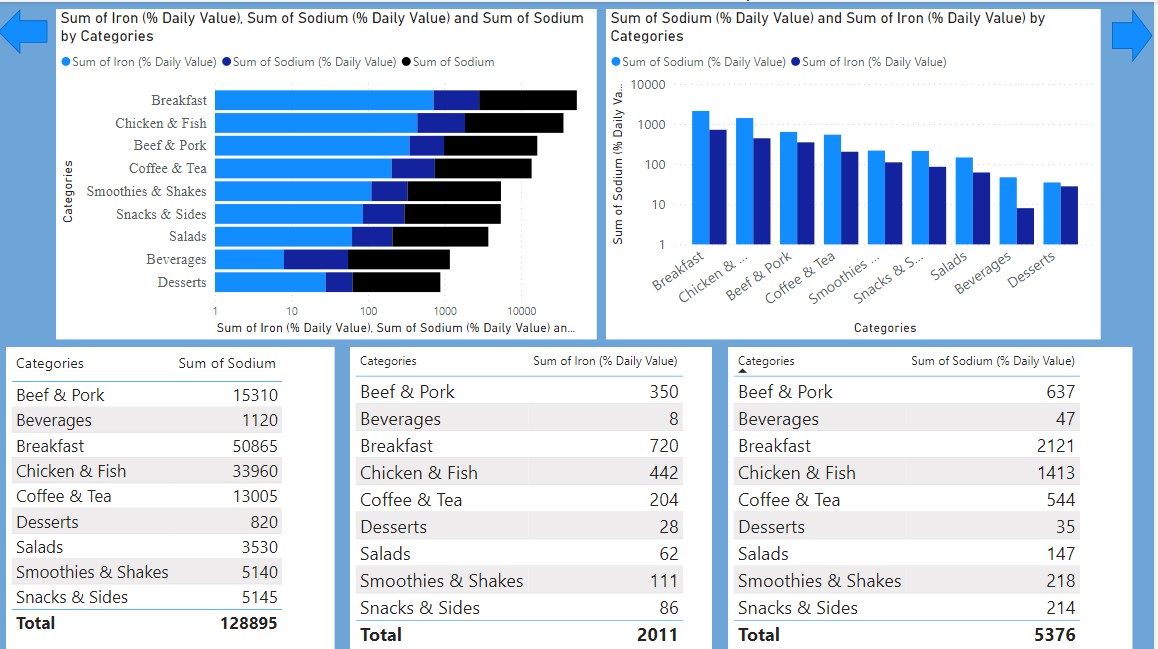
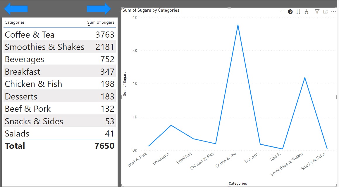
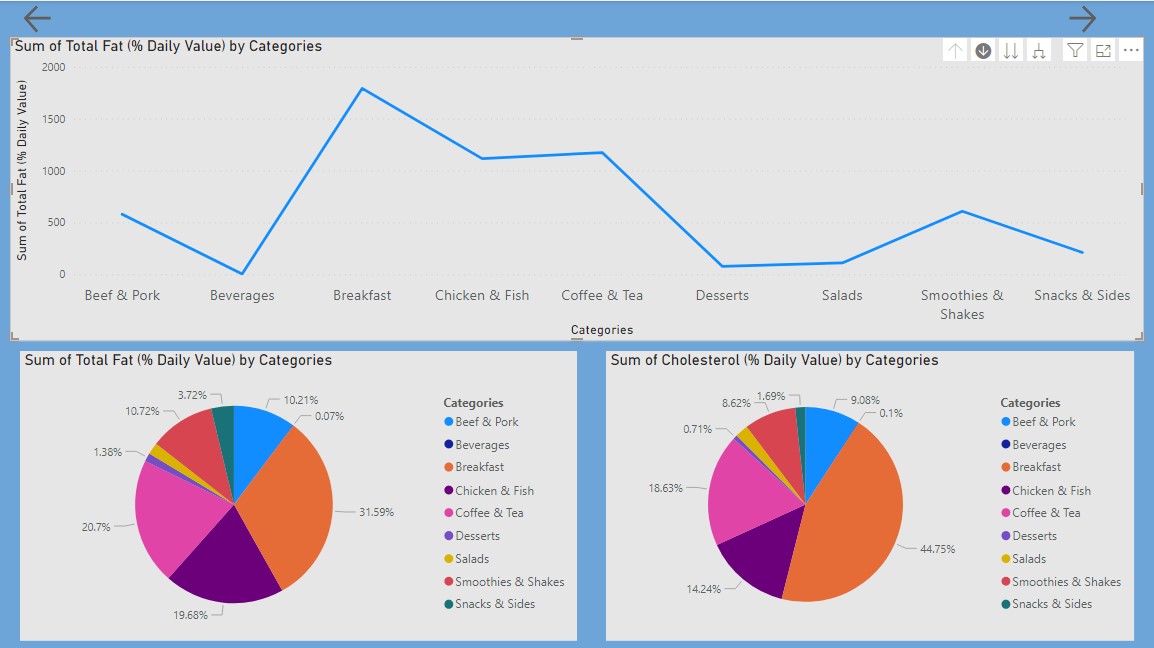
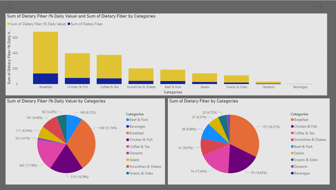
The dataset was visualized using line charts, pie charts, area charts, bar charts, and slicers.
Conclusion
I and the team believe that these visualizations will enable you to make better decisions during your next visit to Mcdonald's.
Thank you for reading this article.